SUMIF and PivotTables can both summarize data based on specific criteria, but they do so in completely different ways. In most cases, PivotTables are going to be faster and easier to get the data that you want, but sometimes using Excel formulas is the only way to handle complicated data.
All the examples from this blog post can be found in this workbook: SUMIF_PivotTable
WHY PIVOT TABLES ARE BETTER
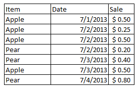
Let’s take a look at a quick example of some fruit sales data, where we want to find information like: all sales for a date, total sales for a fruit in the given time period, or total sales for a type of fruit on a given day.
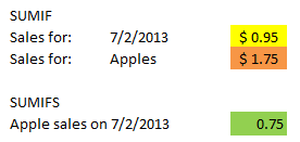
With SUMIF, you can specify the range of values you are using as the criteria (dates or fruit), the values you want to sum (sales), and the actual criteria that will determine if the values are included in the sum (“7/2/2013”, “Apple”). SUMIFS (new in Excel 2007) extends this functionality to allow multiple criteria (dates and fruit):
Note: Excel also offers COUNTIF, COUNTIFS, AVERAGEIF and AVERAGEIFS starting in Excel 2007.
You can do the same with PivotTables, but the PivotTable will also handle sorting, grouping and organizing your data so you can just lift the aggregated values right out from the table:
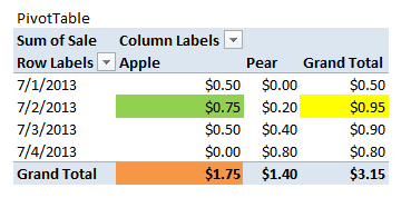
Here the values are automatically generated by the PivotTable. No extra work needed aside from creating the PivotTable, which is as easy as selecting the data range and specifying where the table needs to go.
Excel also applies PivotTable styles, which change be switched in one click and you can even create your own custom styles.
WHY WOULDN’T YOU USE PIVOT TABLES?
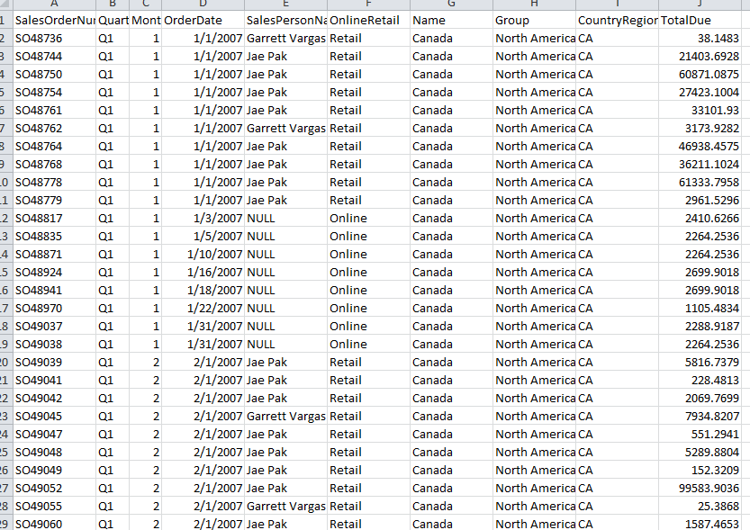
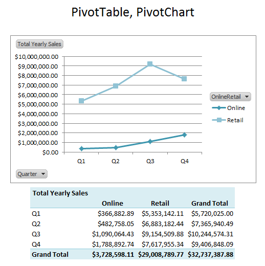
I extended my fruit example to use sample data from the AdventureWorks database, where I wanted to compare online and retail sales for North America, broken down by quarter:
It didn’t take me too long to set up a dashboard that displayed the data that I wanted with a PivotTable and I tossed in a PivotChart as well:
While it was fast for me to create this mini dashboard, I could have run into some problems if I needed to create an elaborate layout:
- PivotTables can be finicky if you need a complex layout or your desired formatting deviates from the defaults that Excel provides. Depending on the layout of the table, you may find that creating the table and formatting from scratch will save you time.
- PivotCharts are rigidly tied to the PivotTable. Whatever is displayed in the PivotTable dictates what is displayed in the chart. If the chart is your top priority, you may want to use regular formulas/data to guarantee that your chart looks the way you want it.
Of course, there is also the overhead of learning how to use PivotTables: it can take time to become accustomed to using them. In which case, it may be more efficient to stick with what you know, especially if you are under a time crunch.
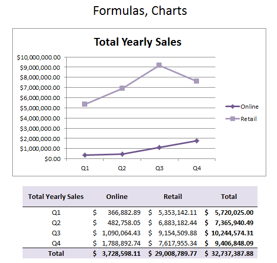
For example, in a similar amount of time (<5 minutes), I was able to create an identical mini-dashboard using my own formatting and SUMIFS formulas:
THE BIG REASON TO USE SUMIF OVER PIVOTTABLES
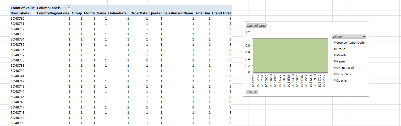
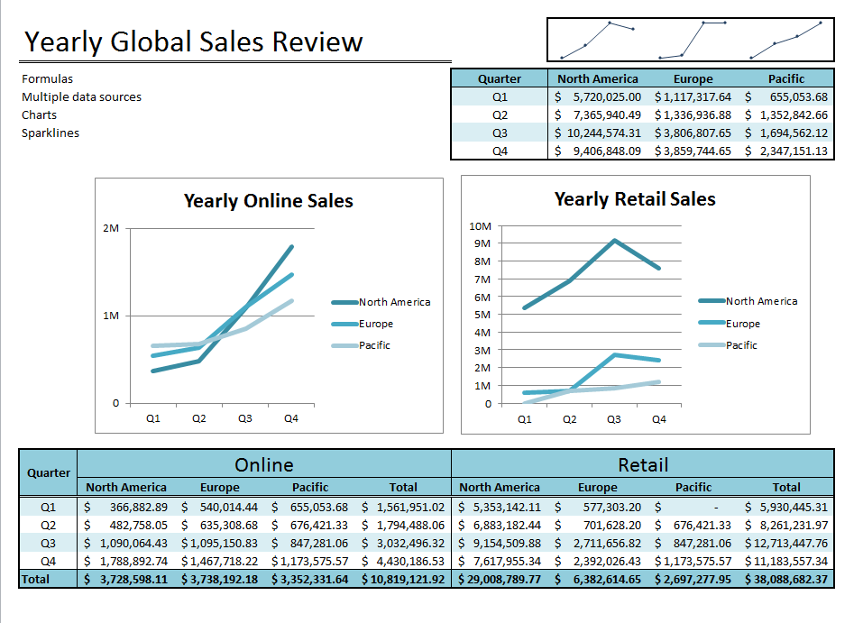
Next I tried creating a dashboard with sales data from three regions, each on a separate worksheet (North America, Europe, Pacific). This proved so difficult with PivotTables that I actually ran out of the time I allotted for writing this blog post and had to move on.
Excel PivotTables are designed to handle a single area as a data source. There is a way to use multiple areas in a PivotTable (multiple consolidation PivotTables), but you need the PivotTable wizard to create them. (If you need help finding where Excel has hidden the PivotTable wizard starting in Excel 2007, check out Debra Dalgleish’s tutorial on how to add the PivotTable wizard to your ribbon).
My first attempt was to use the data sources as is and then a twisted creation popped out of the wizard:
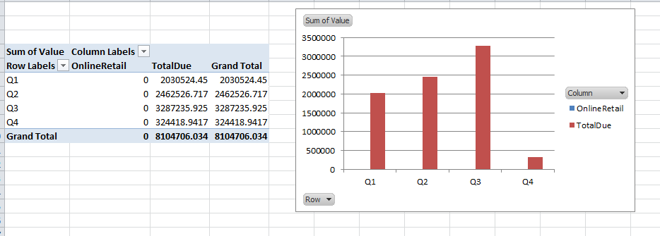
Then I tried manipulating the data to only include the quarter, online/retail flag, and the sales data, but the result wasn’t acceptable:
At this point I had to give up because I was out of time. Then I switched to using SUMIFS and I was able to whip up the dashboard I wanted (with formatting, charts, and sparklines) very quickly:
IN CONCLUSION
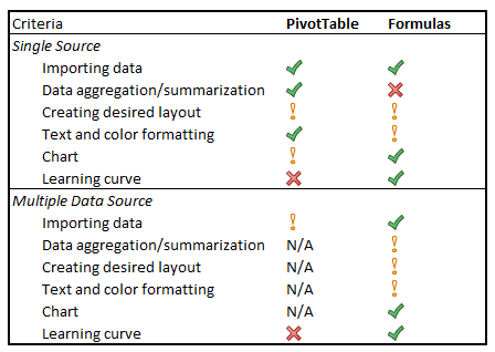
PivotTables are generally faster because they are automatic. Some of the price you pay for being automatic is that layouts and charts aren’t easily customized. Also, if you’ve never worked with PivotTables before, they can be daunting. Using multiple areas as a data source is almost impossible, even if a wizard is available (but hidden).
Formulas are easy to use, so it may save time if you’re comfortable with them, but you will need to create everything from scratch including the formatting. Formulas may also be the only realistic option for complicated data sets, especially if the data is on separate worksheets.
Share the post "When to use SUMIF vs. Pivot Tables in Excel"
 Follow