Graphic Designer, Christiana, spent some time at An Event Apart last week to pick up a few tips and tricks…and retro swag. She provides a quick recap and takeaways from the speakers. Conclusion: worthwhile event for designers and developers alike.
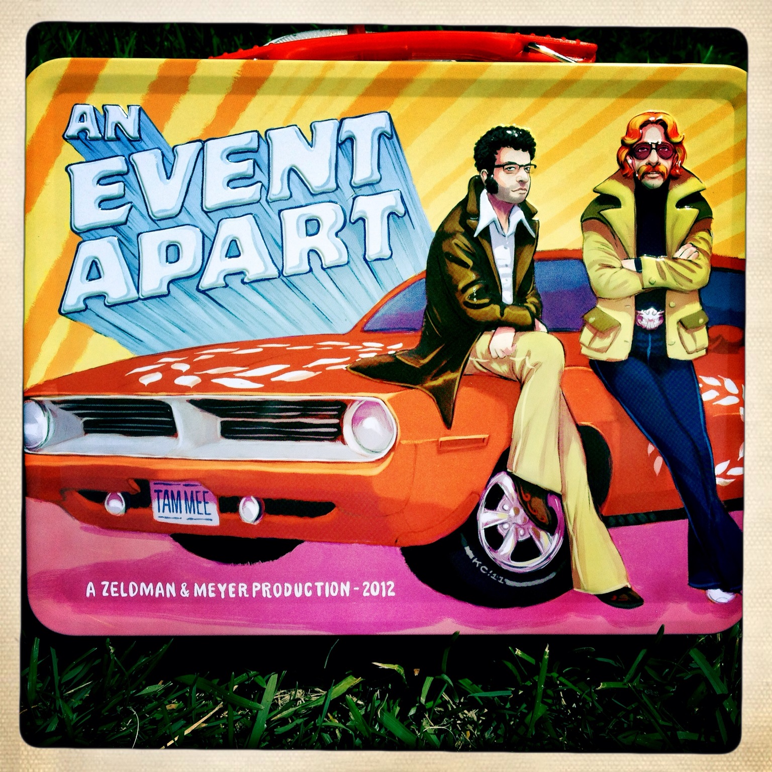
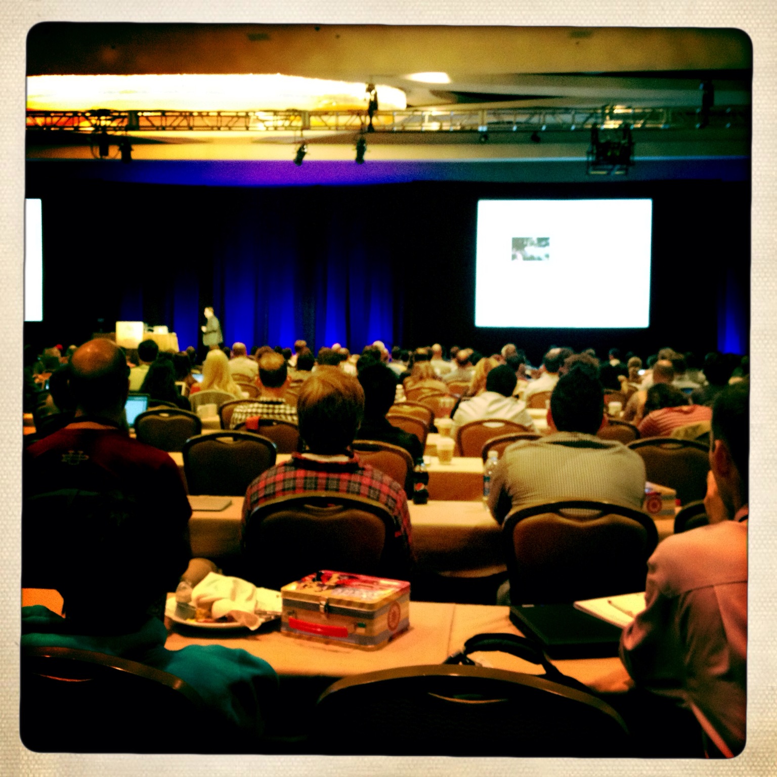
An Event Apart: The Design Conference for People Who Make Websites came to Boston last week Monday – Wednesday. I was excited to see what this conference had to offer seeing as this was the first one I attended that had a combined designer/developer track which was not shuffling you off in separate directions. I arrived to a sea of eager people waiting to soak up some creative knowledge, as well as some pretty cool welcome swag. Lunch boxes for all.
The two day conference was made up of six daily sessions from everything focusing on how to build better content, how to prioritize your content for mobile experiences to design-related fun stuff like typography insights on which fonts work better in which situations. The third day was an entire day dedicated to “Designing for Mobile & Beyond” by Luke Wroblewski. Luke did a great job giving the big picture on how to go from a big desktop version of your website with deep navigation down to a mobile friendly, simple site. He showed a lot of ways to go about prioritizing your content as the screen size gets smaller for your user, great full day session.
Am I making you wish you would have attended? (I know the lunch box sold it.) Well, fear not – you still have time. The conference is headed to Washington DC in August!
Top 5 Takeaways:
1. From the session: Content First! Everything we know is wrong.
Jeffrey Zeldman
We are in control of the content viewing.
Design is “to connect the right user with the right content at the right time.”
Content precedes design. Design in the absence of design is decoration.
2. From the session: On Web Typography
Jason Santa Maria
Type is not an afterthought; it’s not decoration. It’s the voice of our site.
The term “readability” doesn’t simply ask, can you read it? “It asks do you want to read it?”
Good typography can change the conversation. “Good typography is invisible.”
3. From the Session: Mobile to the Future
Luke Wroblewski
Every medium ultimately needs unique thinking and design to reach its true potential.
Radio is not television. The web is not print. Mobile is not a desktop PC.
Reducing friction down to nothing increases usage.
Mobile is…a massive new medium, forces us to adapt & optimize our solutions, and moves us toward the future.
4. From the session: Responsibility in Responsive Design
Scott Jehl
We are overly presumptuous about…
– our users
– the networks
– how people use our sites
– the scripts we install and whether they load
Scott told us how he recently spent 6 months with his wife working remotely from Southeast Asia and how he found that most people there accessed the web over a cell connection. Access was a lot slower.
He said “Accessibility and empathy go hand in hand. Accessibility goes beyond the needs of those with disabilities. It means being able to access the things that we build on the web and removing the barriers.”
5. Designing for Mobile & Beyond
Luke Wroblewski
Enable new ways of presenting & interacting with information.
Design for speed.
Shed unnecessary details and simplify.
Avoid excessive navigation menus.
An Event Apart was three days of delicious information overload. If you are a designer/developer interested in content, responsive design, and mobile usability this is a conference you need to attend! For any tweeters out there, they had a Twitter feed aggregator recording all of conversations if you’re curious to learn more.
Share the post "An Event Apart: For People Who Make Websites"


 Follow