You’ve just finished putting together the best sales report ever, but you realize that the value axis is sporting 9 digits of data instead of the cleaned up version of $1M, $2M, etc…
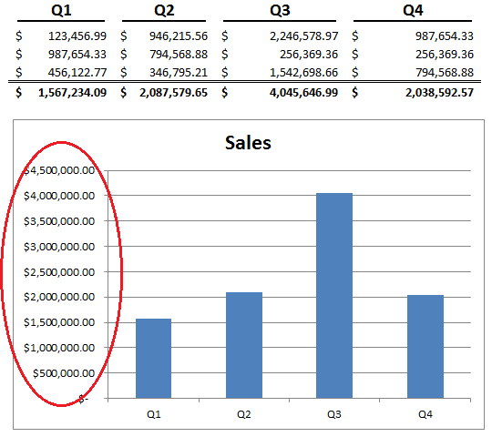
All I wanted to do was to show $1M instead of $1,000,000.00. Was that too much to ask for?? Is there any hope for getting the value axis formatted properly in this forsaken world of despair?!
Yes. Do not despair. It’s pretty easy, actually.
Start by right-clicking on the value axis and going to Format Axis > Number. The number format should already be set to something like currency or accounting and Linked To Source is probably checked off. If you’re not familiar with it, Linked to Source just uses the number formatting from the data source in the chart.
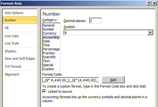
The first thing to do is uncheck Linked to Source. Then, specify the customer number format you want to use. In this case, we’ll work with:
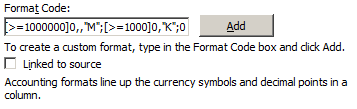
[>=1000000]0,,”M”;[>=1000]0,”K”;0
This specifies that if the number is greater than 1,000,000, format with a single digit, followed by the letter “M.” If it’s greater than 1,000, do the same, but with K instead of M.
Click Add to add the custom number format to the list of available number formats and to apply the format to the chart.
Isn’t it glorious? No more long formats on the value axis! Huzzah! We have found the holy grail! Pizza party for everybody!
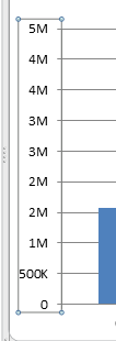
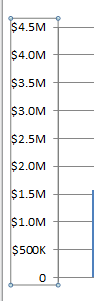
But wait…hold on. There’s a few things wrong here.
There are two 2M, 3M, and 4M markers, not to mention that the $ disappeared too. Well, that’s because the custom format only specified a single digit, so 2,000,000 and 2,500,000 are both rendered to 2M.
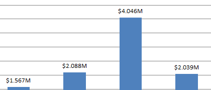
But this is easy enough to fix, just change the portion that specifies the digits (i.e. the ‘0’) to use 1 or 2 extra digits. While we’re at it, we can toss back in the $.
[>=1000000]$0.00,,”M”;[>=1000]$0.00,”K”;0
And there you go:
You can also do the same thing with legend, data label, or category axis number formats as well.
This wonderful gem of insight is brought to you by the Peltier Tech Blog, in particular, their post about Number Formats in Microsoft Excel.
Share the post "How to Fix Those Pesky Number Formats on Excel Charts"
 Follow
Very helpful! To create schedules, it is invaluable to be able to format numbers. Here I have found more about this issue: http://www.excel-aid.com/excel-time-formatting-numbers.html
Thank you for sharing, Julian!