
Pitan here! This is Part 2 of my series on PowerPivot, which started with looking at how PowerPivot handles data. This time we’re covering similarities and differences between PowerPivot and regular PivotTables.

PowerPivot offers all the existing functionality of PivotTables with stronger backend support for data sources. Most of PowerPivotTables is exactly the same as regular PivotTables, but there are a few minor differences. So rather than tell you how to create PivotTables with PowerPivot, since you should theroretically be able to reuse your existing PivotTable know-how, I’m going to focus on some of the differences that threw me for a loop.
Refreshing Data
If you’re familiar with PivotTables, then you probably know that if you make changes to the original data for your PivotTable, you have to refresh the PivotTable in order to see those changes take effect.
PowerPivot is no different, except that it’s a bit more explicit. When you refresh the data in PowerPivot for an existing PowerPivotTable, the PowerPivot field dialog will tell you that the PivotTable also needs to be refreshed.
It’s easy to forget that refreshing PowerPivot doesn’t refresh everything, but at least Excel constantly reminds you.
Formulas
Let’s assume a regular PivotTable scenario, where you might have some data, but you want to create additional columns of data using formulas. All you need to do is use Excel formulas to compute the values you want to include.
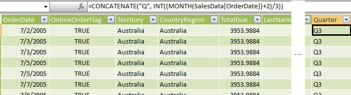
In this example, I have a column of order dates, but I potentially want to use the month values as labels.
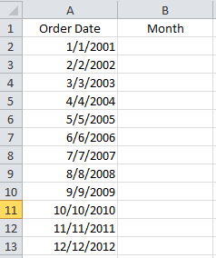
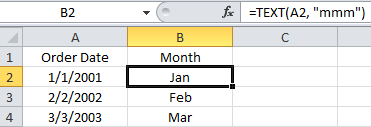
I can use the Excel TEXT() function to format the dates as “mmm” for a 3-letter month.
Then I can build my PivotTable using “Month” as one of the Pivot fields.
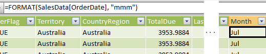
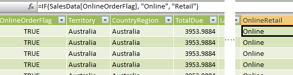
In PowerPivot, you can also add columns to your data using Data Analysis Expressions (DAX), which are very similar to Excel formulas.
Start by right clicking on the blank column to the right of your imported data. Give your new column a name, which will become the Pivot field name.

Then you can build a function using DAX. For the most part, the names and syntax of the DAX functions are the same as Excel formulas, however there are a few differences.
For example, to create the same column of month values, I needed to use the FORMAT() function, which produces the same output as TEXT().
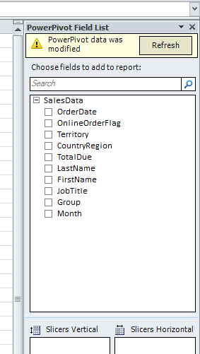
I created a couple other calculated columns for my PowerPivot data source using the same procedure:
So what is the difference exactly?
Well, PowerPivot allows you to define calculated columns in a PowerPivot source (as I did above) or create measures in a PowerPivot table. Both use DAX and make use of the context of where the functions are being executed. Calculated columns always apply the formula to every row in the column, but measures are dependent on the design of the PivotTable to determine which values are included in the computations. For more information, check out Measures and Calculated Columns.
Adding PivotTables
The process of creating PowerPivotTables and Charts is exactly the same as regular PivotTables, but I did encounter a few little twists while working on my example:
To add a PivotTable or PivotChart, in the PowerPivot window, go to PivotTable, where you will have the choice to add a PivotTable, PivotChart, Chart and Table, Two Charts, Four charts, or a Flattened PivotTable.
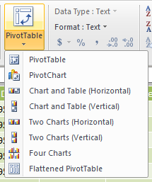
Every Pivot Chart added with PowerPivot will automatically get a separate worksheet that contains the PivotTable that is the source of the PivotChart. For example, Insert a PivotChart creates two worksheets: one with the PivotChart and one with the PivotTable that is the data in the PivotChart. Add Four PivotCharts creates 5 worksheets (one with the charts, four for the PivotTables) etc.
This is to prevent overlapping PivotTables, which, as we know, is an absolute no-no.
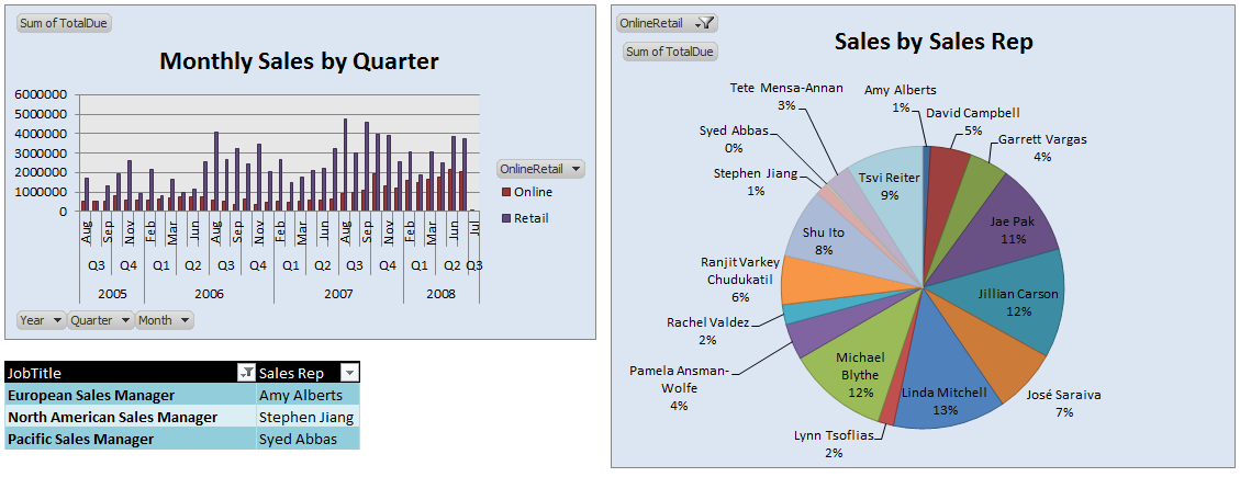
In my report, I started by adding two PivotCharts, which automatically generated two additional worksheets, each with a PivotTable for their respective PivotChart. Then I manually added a PivotTable to the page later. Here’s the layout:
Field Settings
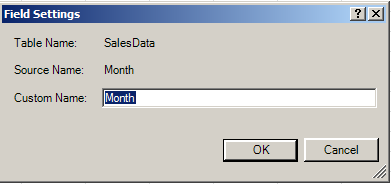
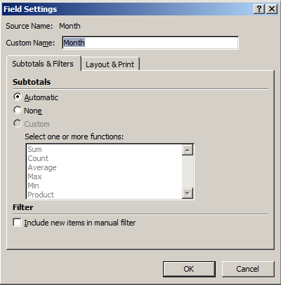
If you need to change field properties, make sure to right-click on the field in the PivotTable. When you try to access the field properties from the PowerPivot dialog, you will get hit with a terribly helpful option to rename your field:
If you access the field from the PivotTable, you get all the familiar settings:
Some thoughts
The focus for PowerPivot has shifted from just processing data to presenting the data graphically. PowerPivot presents many layout options for displaying PivotCharts together in a sheet and makes it easy to implement those charts by automatically adding the PivotTable source sheets.
Someone at Excel HQ had the foresight to know that as people imported more data, filters would become more prominent. This means slicers. Slicers have been built right into the PivotTable dialog for ease in creating and manipulating them.
Aside from that, working with PivotTables and Charts in PowerPivot is the same as it was in Excel 2007/2010. This means the learning curve for creating awesome-looking Pivot reports is negligible.
Join me next time as I tackle slicers in Part 3!
Share the post "PowerPivot Part 2: Copying PivotTable Functionality"
 Follow